The Age of the App is Over
We think in projects, goals, and people. So why are our smartphones built around apps?

When you wake up each morning, do you think: what apps do I want to use?
Or do you wonder instead: what goals do I want to achieve?
For the last decade, our smartphones — the most important computers in our lives — have forced us to think about life in a pretty specific way. “There’s an app for that!” Apple proclaimed, as they laid out the very first home screen in a way anyone could understand.
This was comforting at first, as we built our tool belt of utilities — a million little apps that did just one thing. But today, our digital lives are far more complex. Instead of working inside one app at a time, we work across them, pulling together bits and pieces of each to accomplish the task at hand.
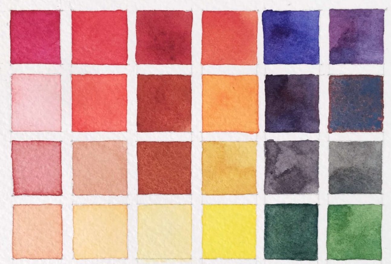
A chat room from one app. A style guide from another. A how-to, and a bug report. And an empty email, to write out what we learned. In our minds, these apps bleed together like watercolors to help us achieve one goal, but on our phones, they’re confined to their own tiny boxes laid out on a perfect grid.
Each of the things we need is but a page inside the apps we use, but we can’t tear them out to create a system that works for us. You can only tap that big brand logo on your home screen and dive in from the top down, each and every time.
As we begun work on Arc for Mobile, we came face to face with truths like these. Things we’d never questioned! And we realized that our lives don’t revolve around apps — they revolve around people. Projects. Goals. Tools. And the space you’ve created to bring it all together, and get something done.
We wondered: how can we better design the computer of the future around this truth?
And we asked: what if our home screens felt more like home?
We initially designed Arc for iPhone to be a mirror for your Spaces on desktop — a place to look for things you’ve saved.
But the more we used it, the more we discovered that it was the missing home screen we didn’t know we needed. It allowed us to pull out just the parts of apps we wanted, whether it was a document, a photo album, a playlist, or a chat room, and organize it inside Spaces for different parts of our lives. Thanks to deep-linking, tapping one of these pinned tabs bounced you right over to that exact place inside another app.
We grew more excited as we realized the same principles underpinned how we organize our homes in real life. Is a home cozy? Spartan? Or cluttered?
No, a home is only what you make it — with all your habits, character, and idiosyncrasies.
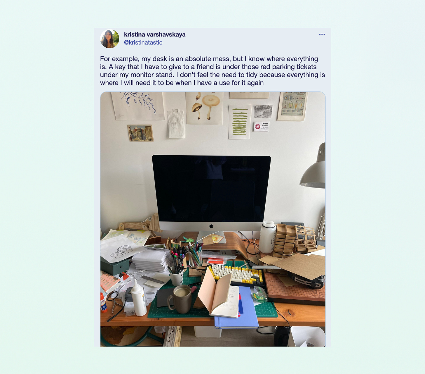
The reading corner of your couch, with the slightly frayed cushion beside an always-messy pile of books, still to read. Your desk on a Monday morning, most papers cleared off, except your notebook and planner. Your studio one evening, with your inspiration, materials, and tools all splayed out to every corner.

These spaces are messy and wonderful, and can’t be confined to one grid or system. Because it’s your system.
So why then, when we boot up our computers and smartphones, are we forced to organize everything under a system designed for everyone? Just imagine if all of your furniture was bolted down to a neat grid, or the different rooms in your home were organized by brand instead of purpose!
And so, how might we create a new framework for computing that feels more like home?
We still believe that "if our hope is to create software with feeling, it means inviting people in to craft it for themselves — to mold it to the contours of their unique lives and taste.” And we have a few thoughts on how to make that happen, but if you know us, you know that the prompt is almost always more interesting than the answer.
What if you had one mental model for how to find things? For example, one search bar to search all your apps, instead of needing to remember exactly where the search box lives in each of them. You deserve the ability to pull out parts of those apps to form projects — your own little library of things you need.
What if you had the right to build your own structure to organize your life? Whether you’re a minimalist with just one Space, everything splayed out, or a productivity pro with a dozen Spaces — one for each and every project — there’s no right or wrong. There’s just what works for you, and you should have the ability to execute it.
What if you had the ability to express yourself in your space? While Arc is still limited in how much you can customize your Spaces and Sidebar, we look forward to offering many more ways in the future. Because one wallpaper is not enough to make you feel at home. It’s a soundtrack. A texture. And so much more.
While we can’t fully say we’re now using Arc as our main home screen on iPhone, we do fully believe that the era of computing revolving around apps is nearing its close. It’s just a matter of when.
Apps are incredible tools to get things done, but maybe they aren’t the best filing cabinets, desks, and spaces we need to manage our disparate worlds — and to inspire us to be our best selves.
So, whether you’re an app-maker or just an app-lover, dream with us: how would you design a digital space to help you be your best self?
Our instinct is that dragging apps around a grid is not the only way.
We can dream of something better.


EVOLUTION AT ITS FINEST!!!
Here here!
The new mobile app is brilliant. Throughly love the implementation of utilizing the share function. It’s fast, easy to use, and innovative.
Also the app itself has a great design. Congrats on the new product! Cheers.
PS - it’s too early for me to write up another on throughly fresh comment so don’t be shocked if you see this in the App Store review 😅🫠